Usability Test
Programs
Figma
Roles
UX / UI Design
Usability Test
Description
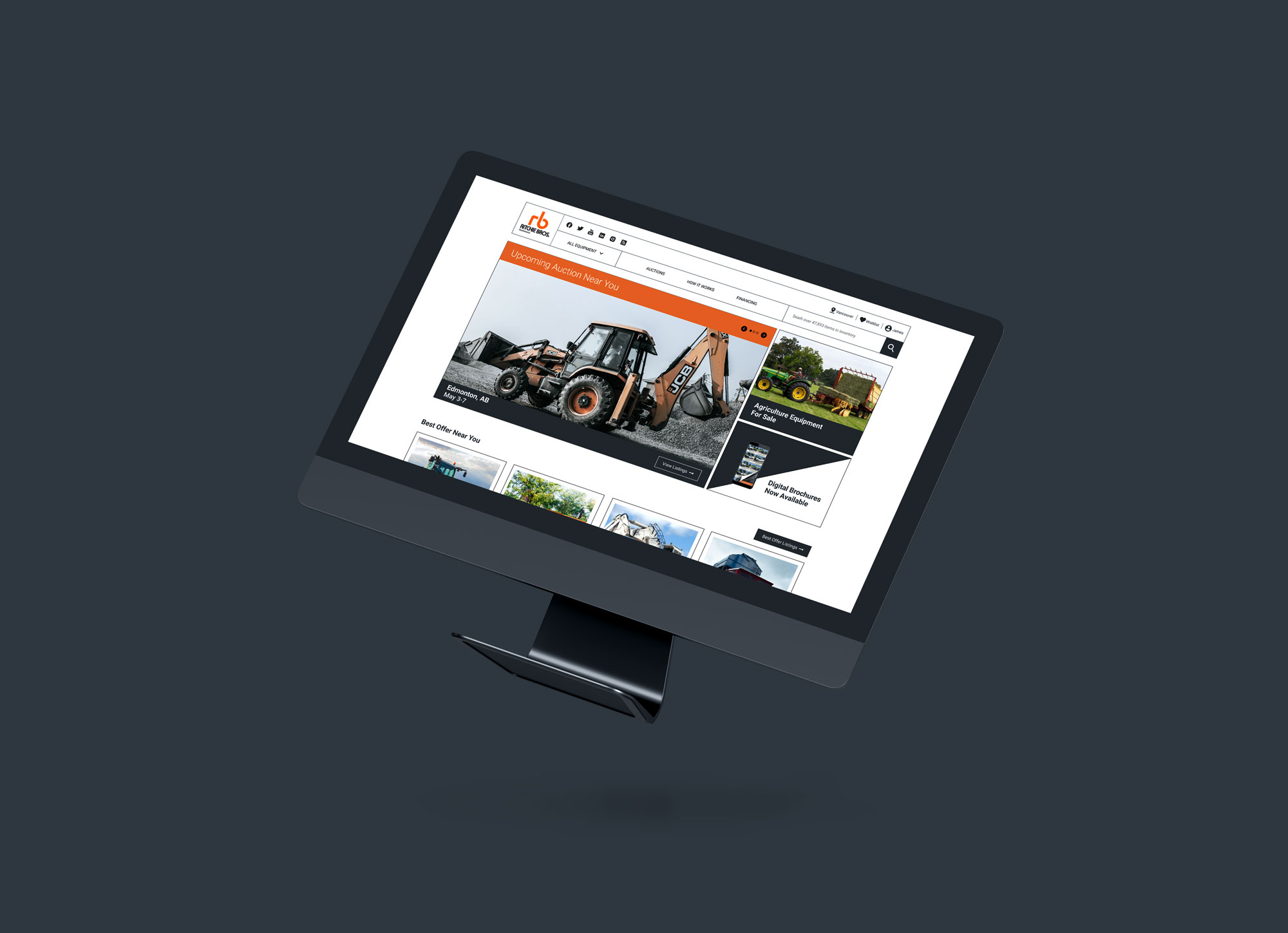
Our team put a Ritchie Bros website to a usability test to see how user-friendly it is to navigate and find information on the page. The purpose of this project was to identify major pain points and frustrations experienced by the user to understand where improvements could be made.
UX / UI Design
RB Auction
01.
02.
03.
04.
05.
01.
Goals
USER GOALS
- Complete tasks defined in the usability test for efficiency and ease.
- Understand if labels and navigation are easy to understand and browse through the website.
- Provide feedback for improvements on any issues that were unclear or not consistent on the website.
TESTING GOALS
-
Describe tasks for users to complete on the current website for feedback.
-
Review results from the test to see what areas are challenging and look for improvements.
-
Feedback from users on their experience completing tasks and overall look of the website for improvements.
02.
Audience Analysis
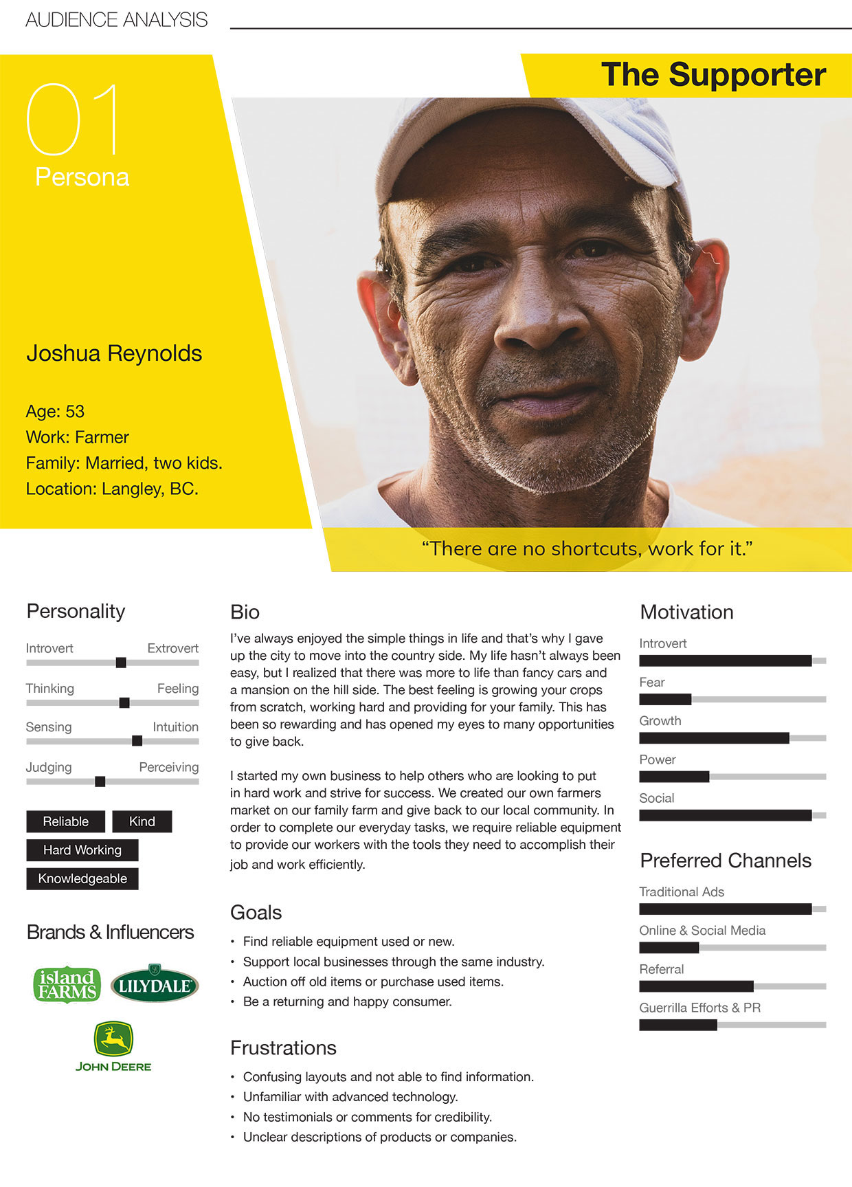
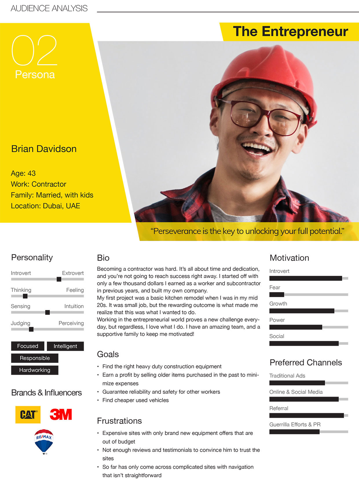
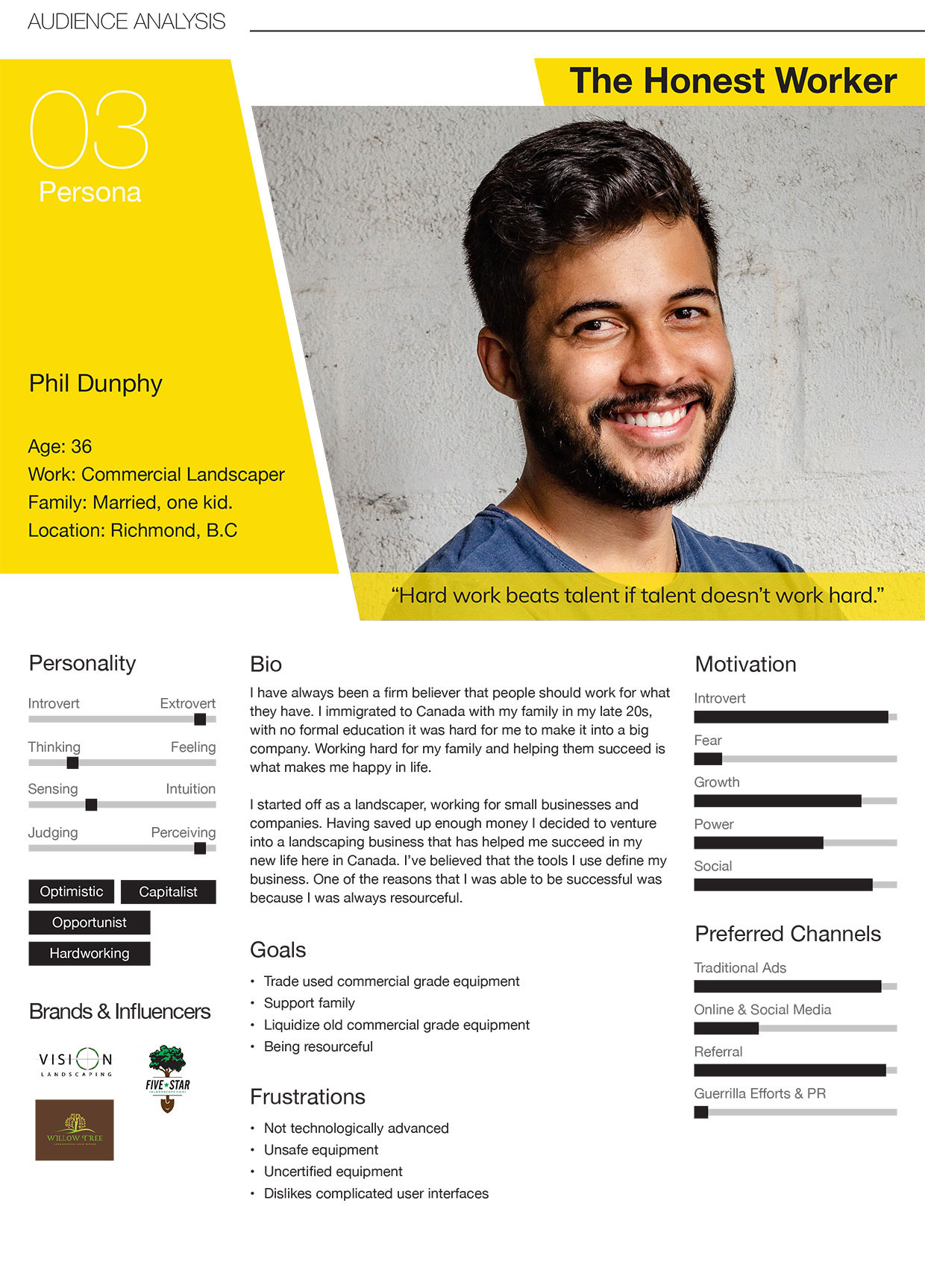
We did some research and looked into finding both our primary and secondary audience that would use the Ritchie Bros website for browsing or purchasing.
Primary Audience
Industrial workers
These are people who own businesses and require the use of industrial equipment as everyday use in their projects or workspace. However, they also want to find used or sell any equipment. This can be contractors or large government organizations.
Secondary Audience
Entrepreneurs
These people are independent workers in smaller businesses and require equipment in smaller quantities for everyday duties. This can be agricultural workers that might be looking for used equipment instead of purchasing new equipment.
We have created three personas that would fall within the primary and secondary audience for analysis.
03.
Methodology
STEP 1
PRE TEST QUESTIONNAIRE
STEP 2
PREFERENCE TEST
STEP 3
CLICK TEST
STEP 4
5 SECOND TEST
STEP 5
TASKS QUESTIONNAIRE
STEP 6
POST TEST QUESTIONNAIRE
PARTICIPANTS
Provided an overview and instructed on what tests they would be evaluated with.
ENVIRONMENT
Due to restrictions and COVID-19, the tests were conducted Online or in a home environment. The participants were introduced to the moderator, observer and organizer who would be evaluating the test.
ROLES
Moderator – Welcome and introduce the participants to the test environment. Tests were explained to each participant and encouraged to speak aloud.
Observers – Take notes on any issues, comments or feedback during the test.
Organizer – Set up all tests for the participant beforehand and set up recording before starting.
PROCEDURE
- Participants were encouraged to speak aloud while the moderator guided them through each test and offered support with any questions. All users were familiar with searching for products Online but few had purchased a product through an auction Online.
- The organizer did a test record before the participant session was recorded. Troubleshoot any bugs or issues that came up at the moment before the test began.
- Observers noted any interesting comments or details that came up during each of the tests and tasks.
04.
Data Analysis
COMPLETION RATE
From the results, we took notice that Task 3 had the longest duration out of all tasks, and more than half of the participants struggled to complete it. While everyone was able to complete most of the task, from the comments gathered by our observer, it appears that many of the participants were frustrated with the filtering and locating the specific item through the website. We have highlighted this result and will further investigate the process of filter for different products.
USABILITY HUB RESULTS
PREFERENCE TEST
Which website layout do you find easier to browse?
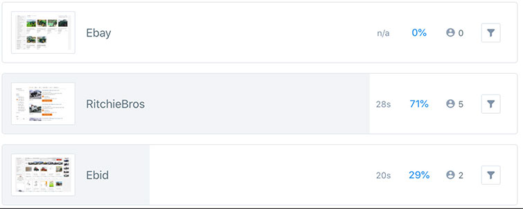
Why did you choose this layout?
- Larger font, more colour, bigger pictures, more emphasis on pictures.
- It has more information on the page.
- It’s cleaner than the other two websites.
- Easy to navigate.
- Feel it’s more organized and easier to see the information.
CLICK TEST
Where would you click to learn about auctions?
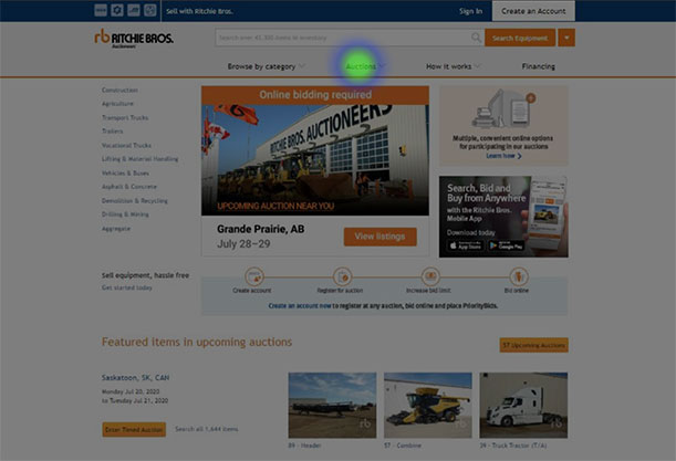
Why did you click on that particular spot?
- It has a drop-down menu, and it says auctions.
- It says auction.
- It’s on the navbar with the word auction.
- Show auctions.
- Said auctions and it had a tab.
5 SECOND TEST
Look at the interface for 5 seconds and remember as much as you can
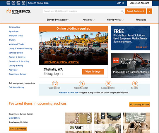
What words or phrases do you remember, from this page?
- The upcoming auction, starting bid, Chilliwack.
- Categories, auction, financing
- I remembered the auction.
- Auctions, images
- Auctions, pictures of a tractor, search bar, the colour orange
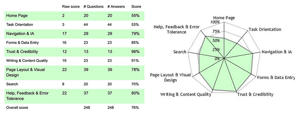
HEURISTIC ANALYSIS
The Heuristic analysis broke down the different aspects for the usability of the site. It determined the user experience and how well it performs against the usability principles that should be followed in web design. We could quickly overlook any user interface (UI) issues and anticipate areas that might need to be looked into further.
SEVERITY SCALE RESULTS
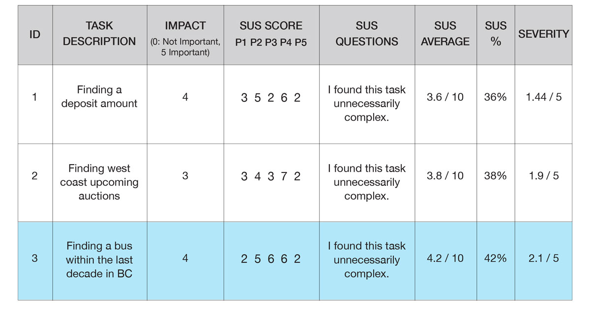
After the tasks testing, we asked a simple survey to the testers whether the tasks were unnecessarily complex. Closer to 1 point means strongly disagree, 10 points means strongly agree on sus average. It was then combined with impact statistics to yield a severity rating.
05.
Design
What We Found
Based on the comments and feedback our testers provided for us, we believed that RBAuction’s filtering system could be improved upon. While all 3 of our tasks were completed, there were issues with the ease of use, especially task #3. It is important that the user does not feel frustrated when using the main mechanics of the website. When considering the target demographic, it would be great to improve on the ease of use, especially on the search filtering functions of the website.
PROTOTYPE
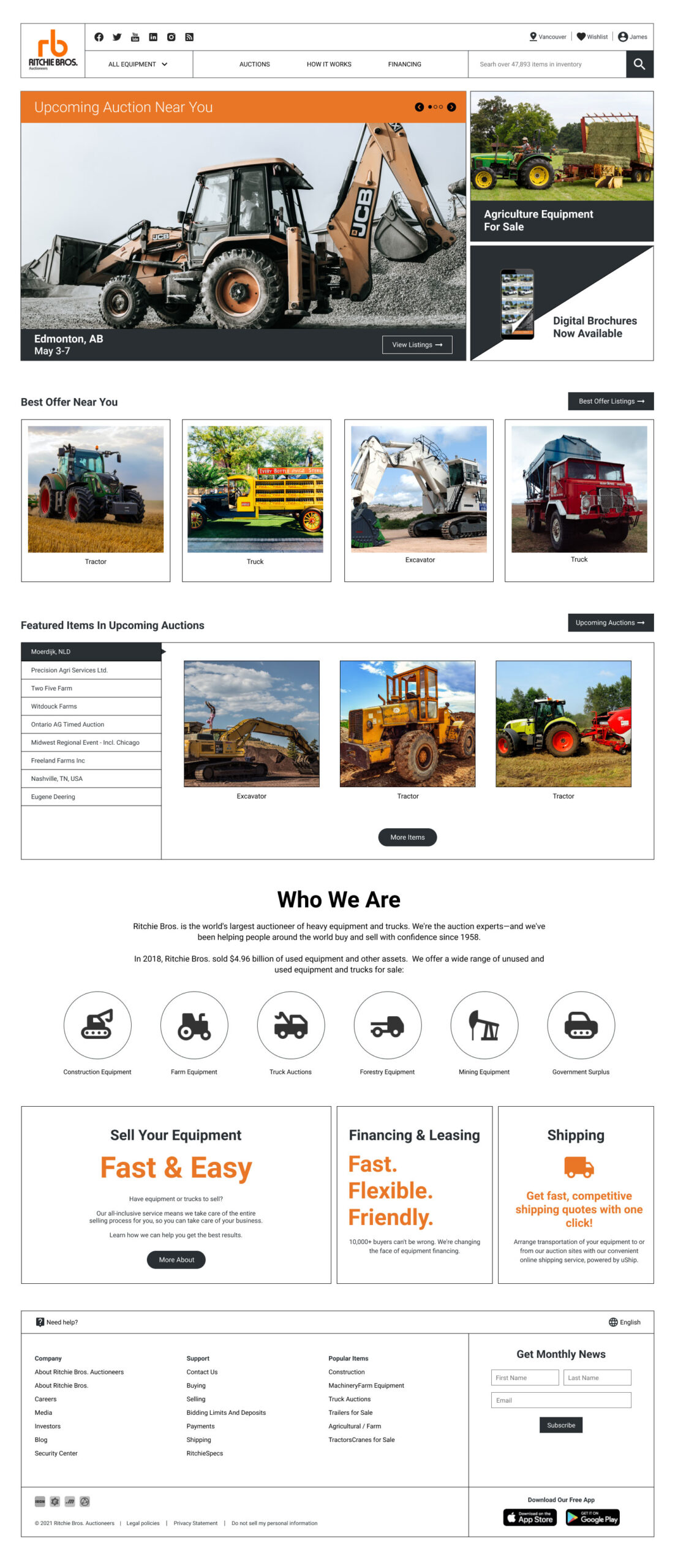
Home Page
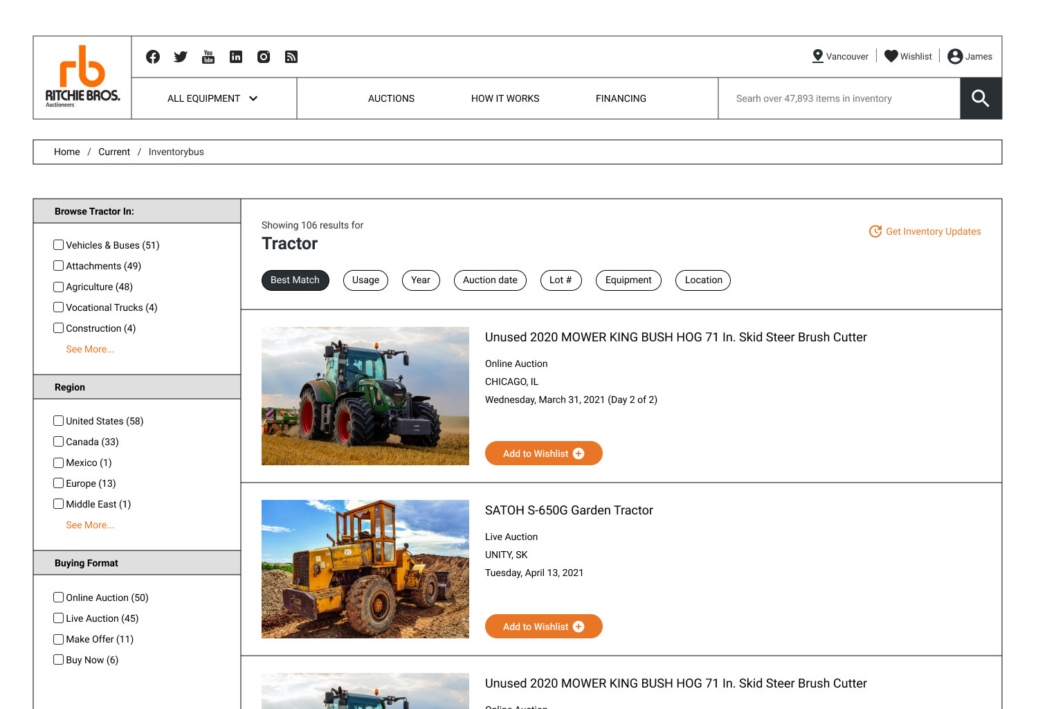
Equipment List Page
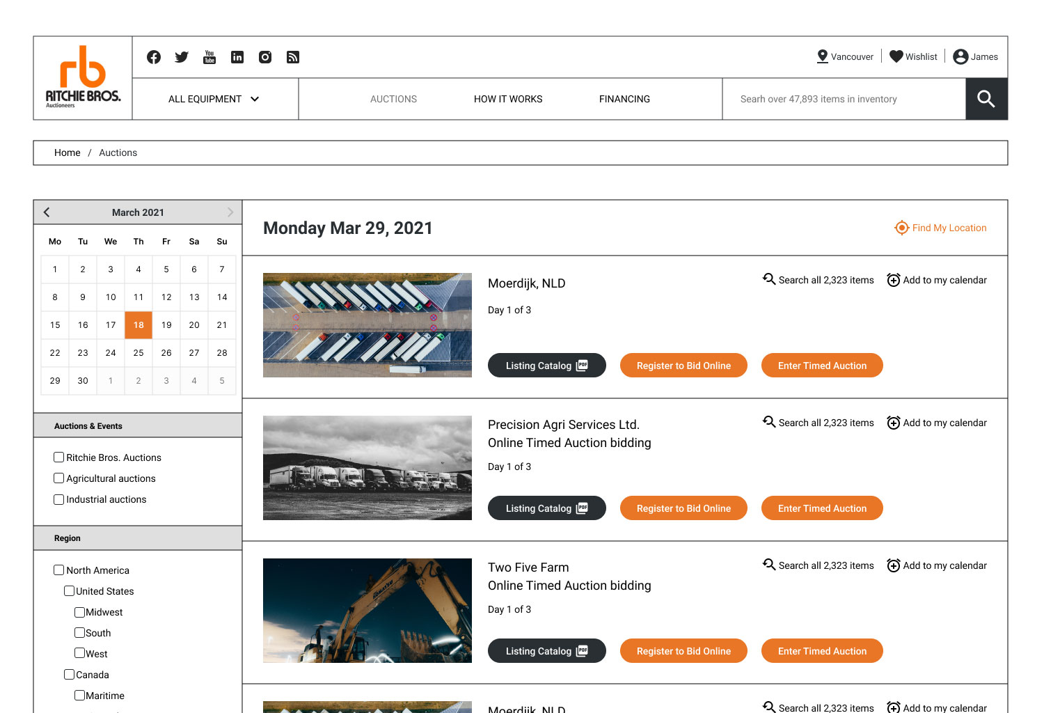
Auctions Page
Fare Dealing Statement
This usability test report may contain copyrighted material the use of which has not been specifically authorized by the copyright owner. This usability test has helped me to promote my capabilities and advance my education specifically in the area relating to user experience (UX) research and includes my personal opinions, satire, criticism and review. I believe this constitutes a ‘fair use/dealing’ of any such copyrighted material.

