UX Case Study
Programs
Adobe Photoshop
Adobe InDesign
InVision
Roles
UX / UI Design
Description
The purpose of this project was to analyze the current website, find ideal users, create prototypes, and conduct usability testing. As a result, it figured out how to improve Pennyjuice sales by meeting user needs and increasing user confidence in products and the brand.
UX / UI Design
PennyJuice
01.
02.
03.
04.
05.
06.
01.
Analysis
THIRD-PARTY ANALYSIS
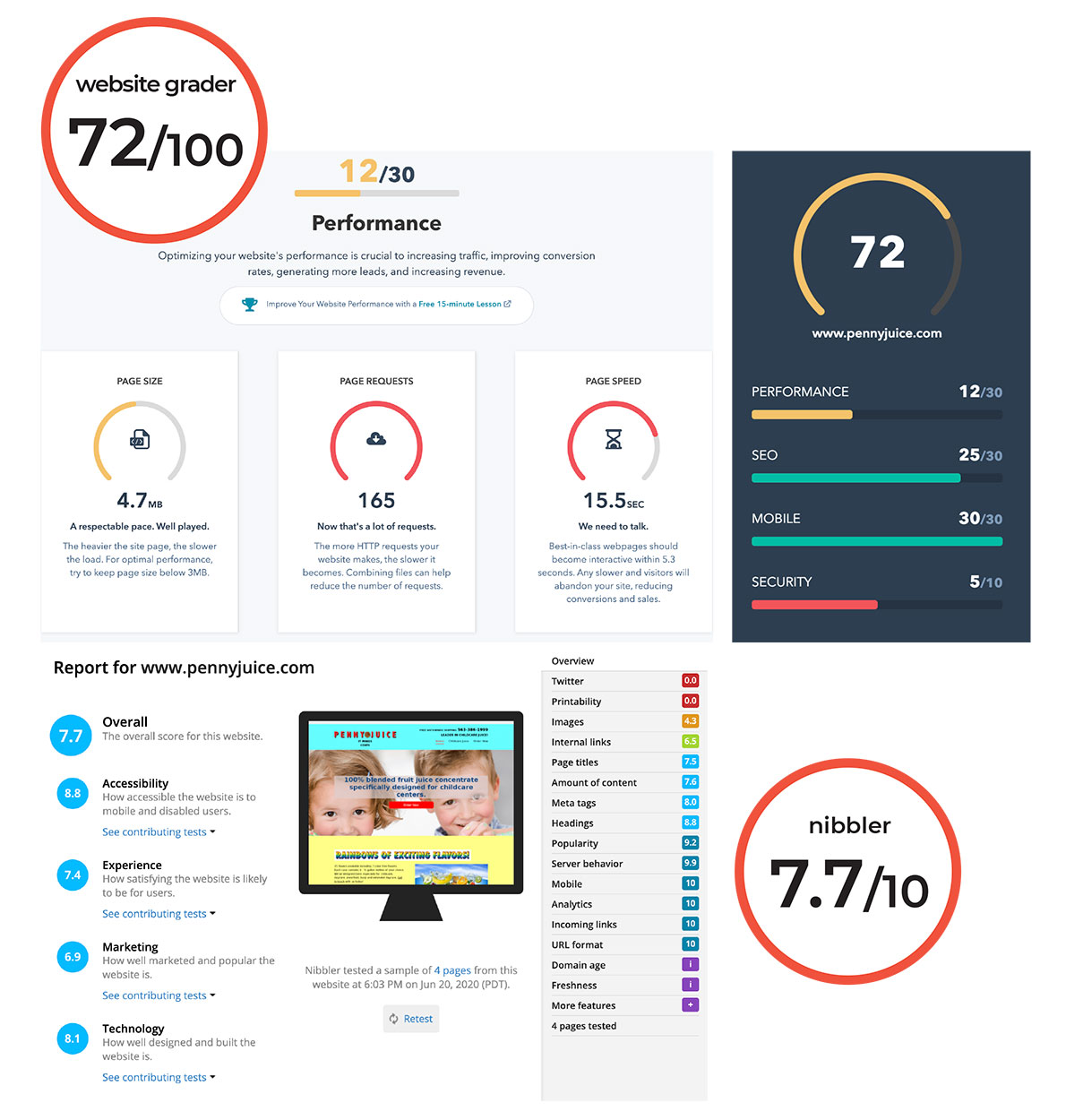
Third-party tools such as WebsiteGrader and Nibbler rated the website with 72 out of 100 and 7.7 out of 10. Notable weaknesses were page requests and page speed. The HTTP requests of the website were 165, which was five times the recommended requests 30. The page speed was recorded at 15.5 seconds, nearly three times the recommended 5 seconds. In addition, it required the use of descriptors or phrases to help with search engine optimization.
CONCEPT MAP
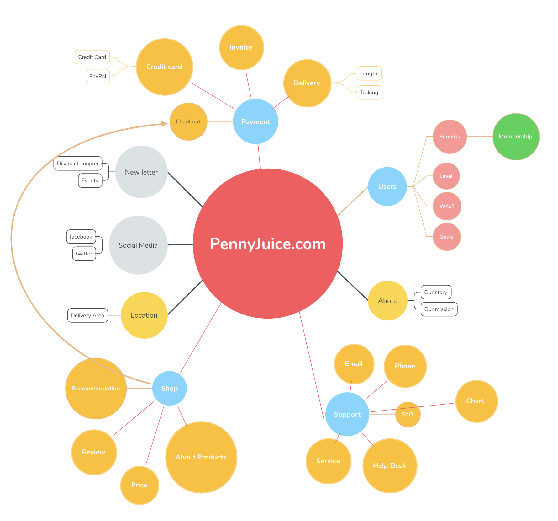
Next, I created a concept map to understand the differences between approaches and design a new service for Pennyjuice.
02.
Empathy
Persona
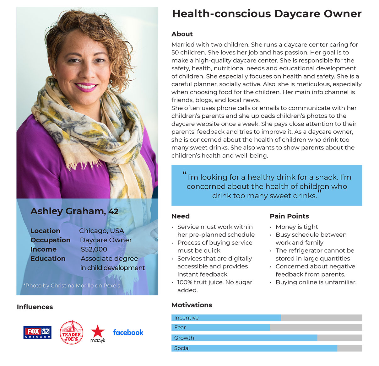
It was important to understand the target audience correctly to improve the website. I developed a character and added a background similar to a user who is a consumer of the Pennyjuice. As a target user, she provided real experiences by adding motivation, needs and pain points.
TASK ANALYSIS
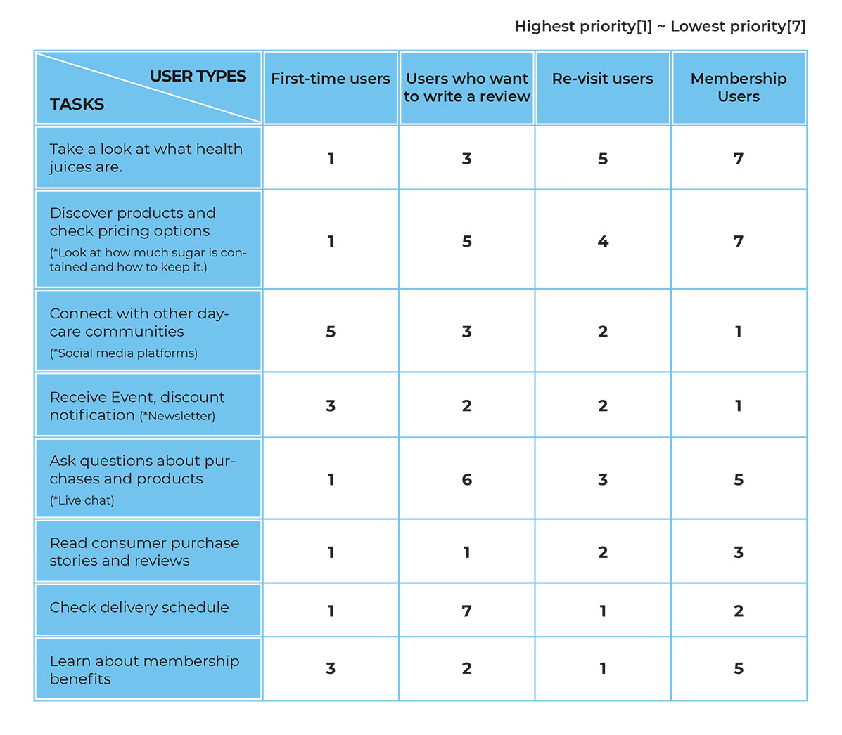
Task analysis was divided into four levels, from first-time users to membership users, and prioritized the tasks for each user type. The task analysis could better understand the problems faced by users. It also helped identify areas for process improvement and predict what users could do to reach their goals.
Customer journey map
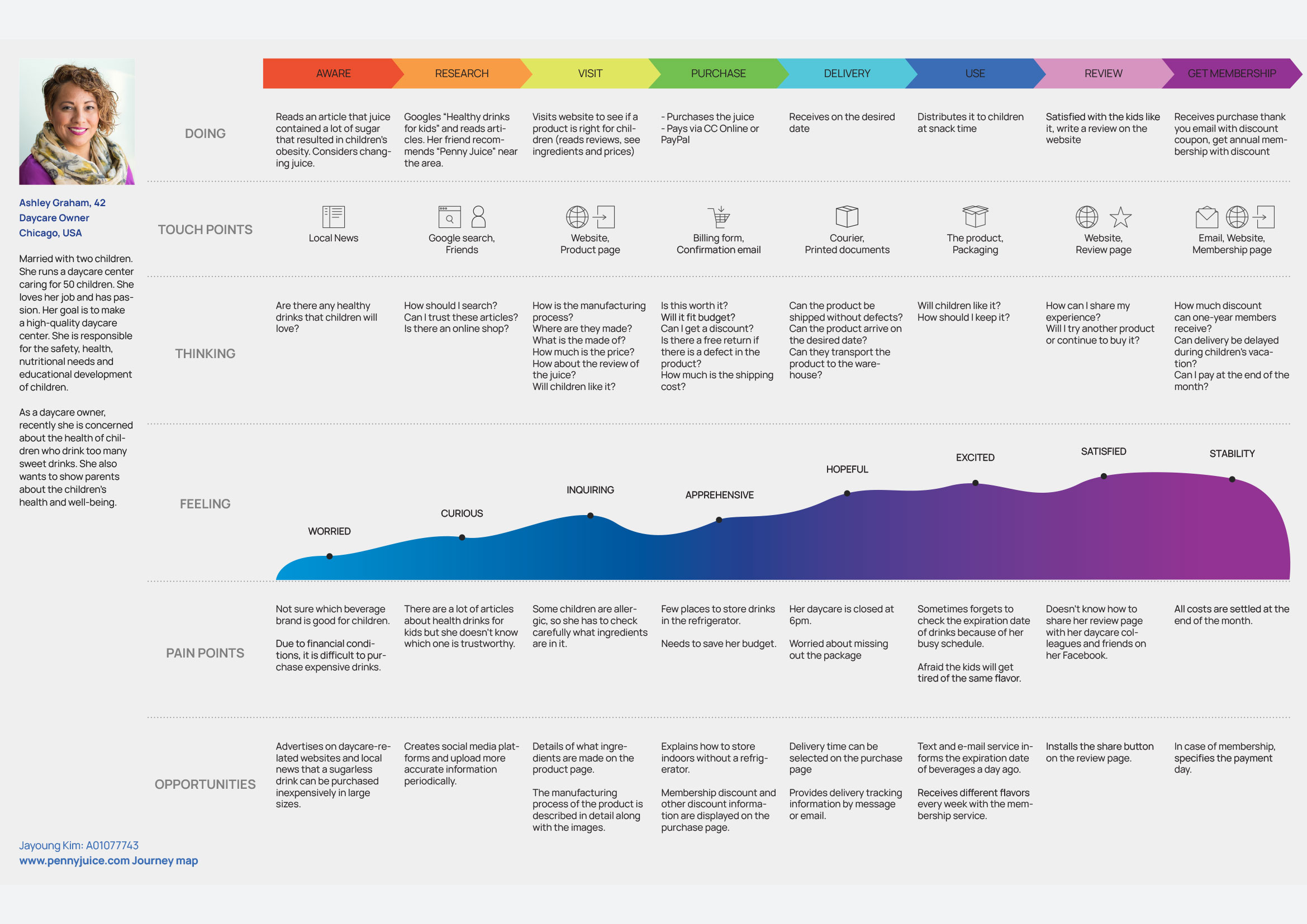
I created a customer journey map based on the ideal persona to understand the current and future states. Persona’s actions, touchpoints, thoughts, feelings, pain points and opportunities were detailed along each stage of the journey.
03.
Ideation
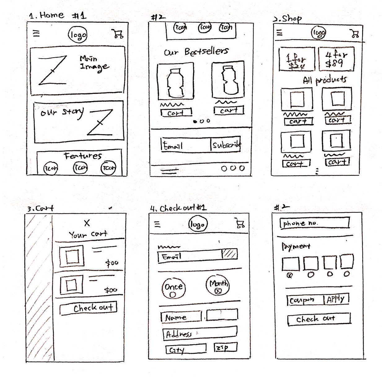
PAPER Wireframes
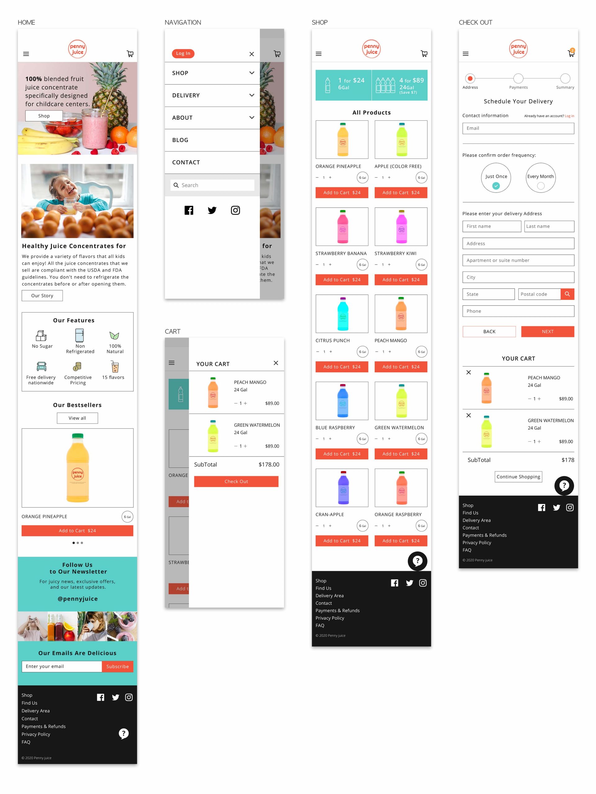
Based on the information gathered so far, I drew paper wireframes of the main screen needed to complete the main user task to be tested. I focused on the main task of the mobile website, from the product page to the order.
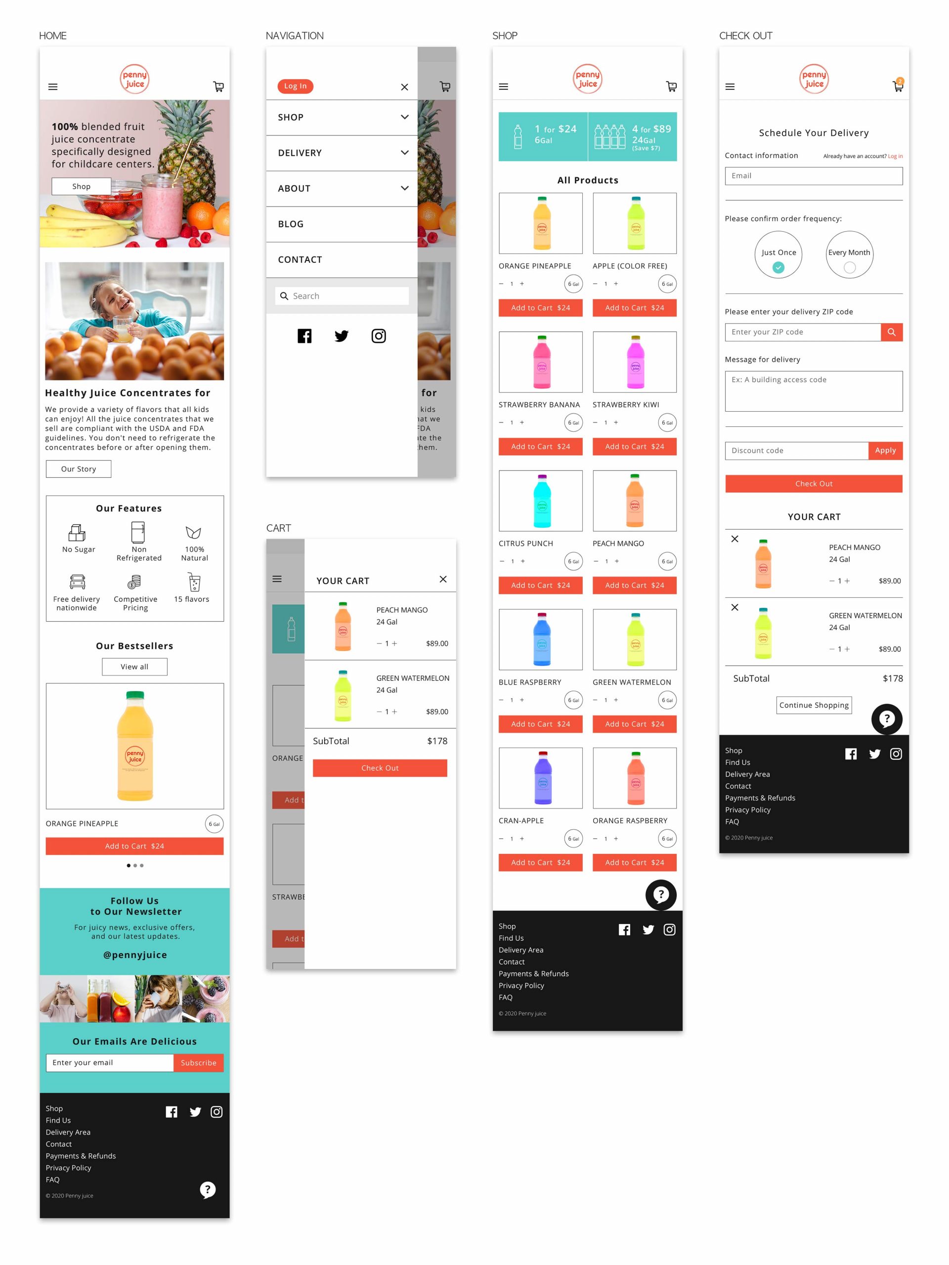
MID-FIDELITY PROTOTYPES
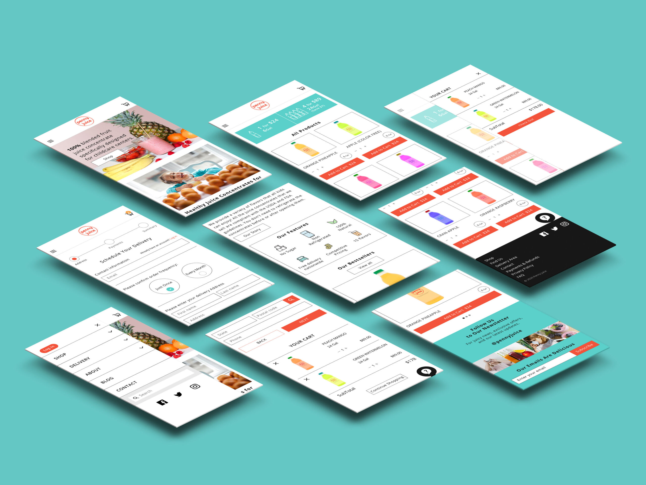
In this stage, I created specific pages by adding a branded logo, colours, and images.
04.
Validation
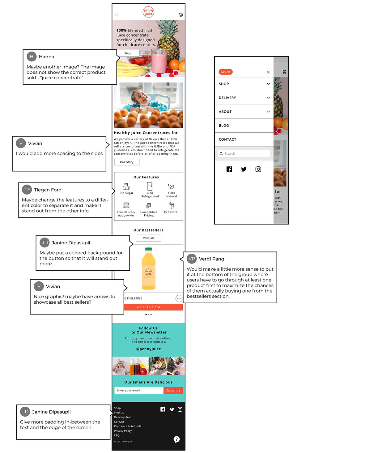
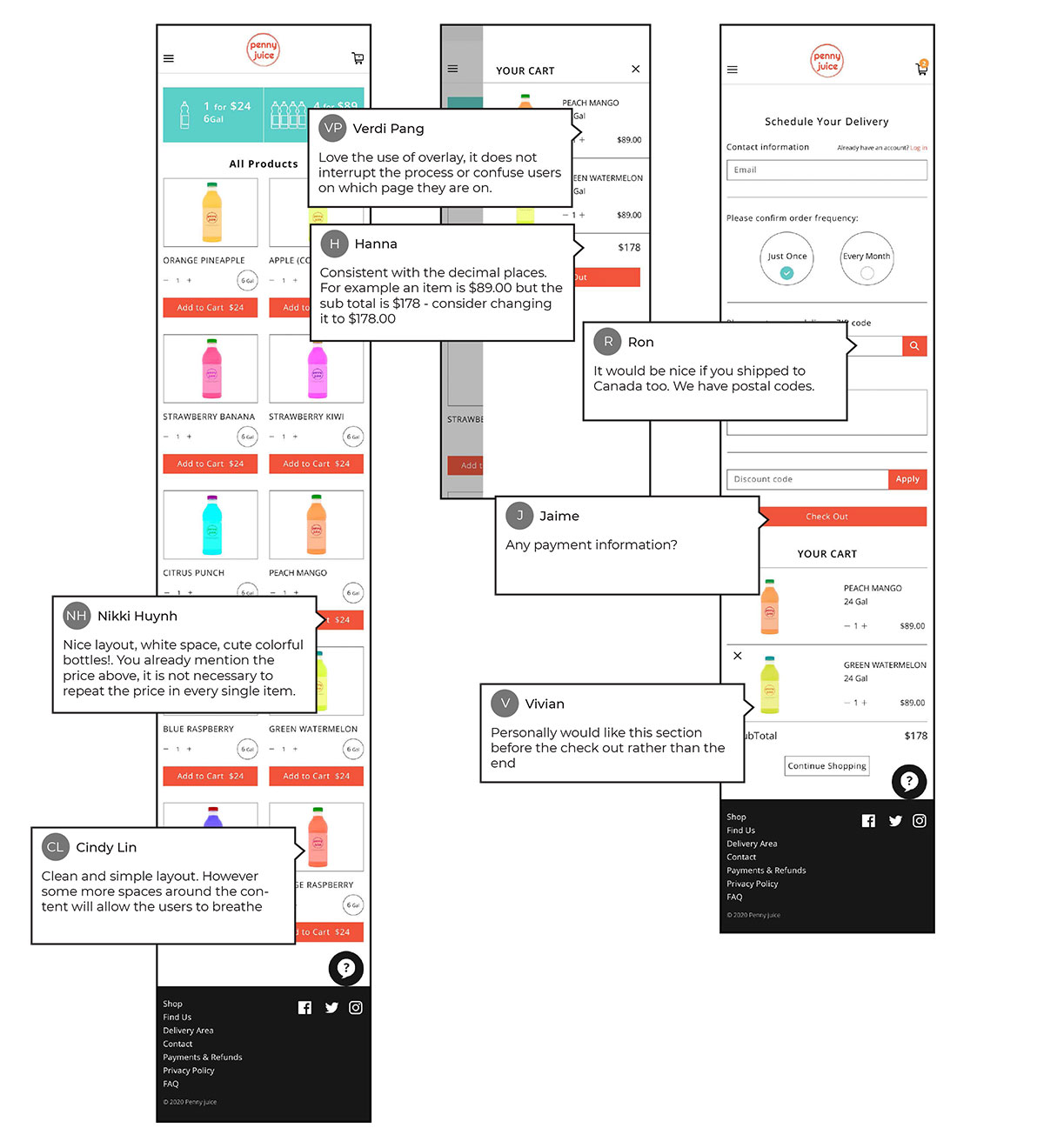
IN-VISION TESTING
I conducted InVision testing on the mid-fidelity prototypes on a mobile phone to see what needs to be improved.
05.
Final Design
HIGH FIDELITY PROTOTYPES
In this stage, I revised the prototypes by reflecting the feedbacks received from the InVision testing.
Check out the High Fidelity Prototypes on InVision.
https://invis.io/E3XVXDUMGFW#/423429459_HOME
06.
Style Guide
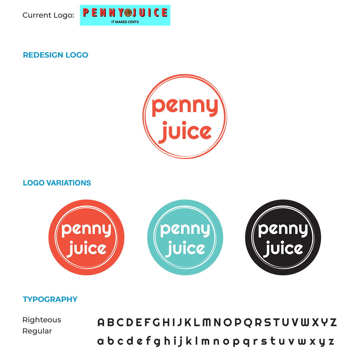
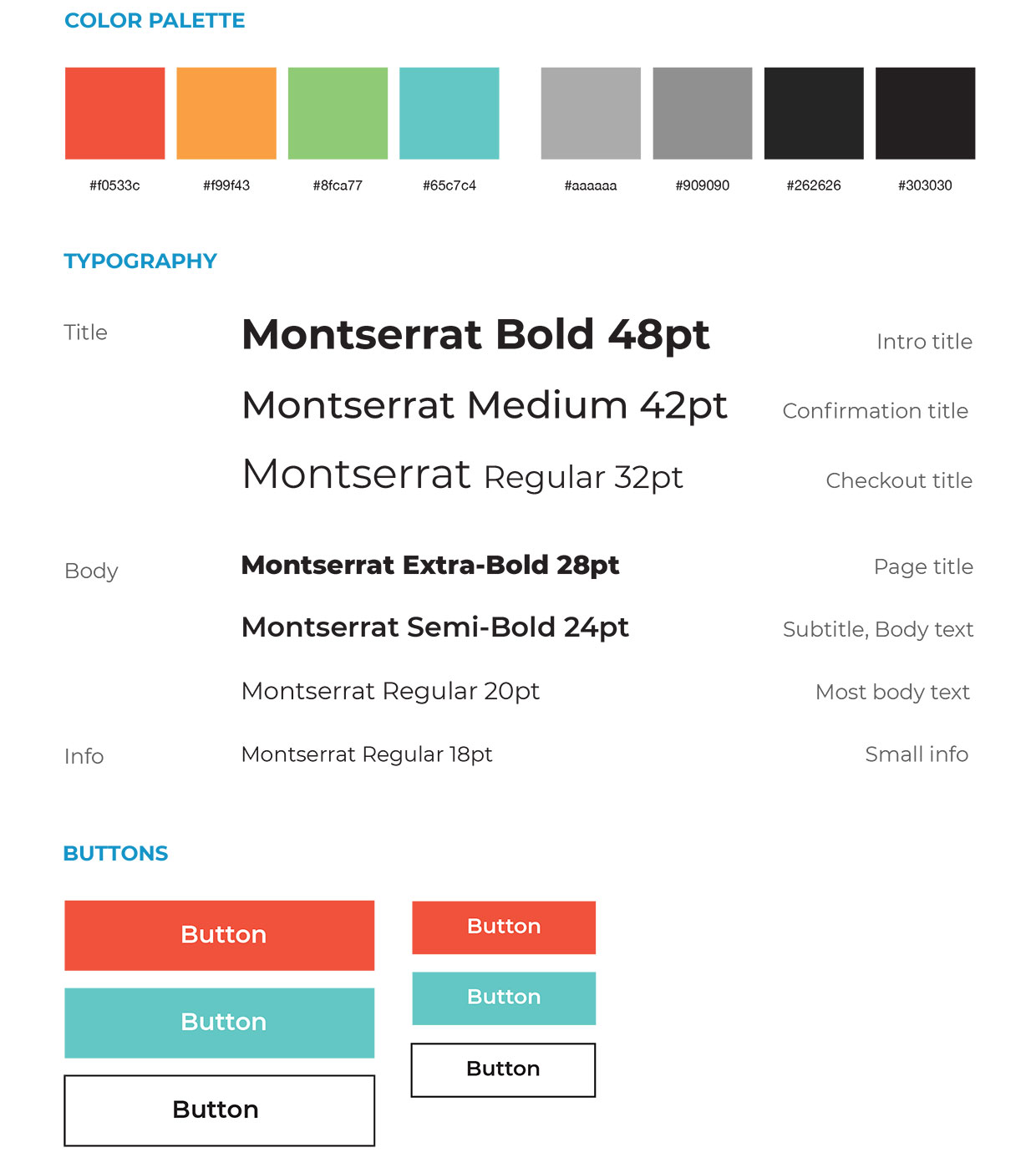
After making the paper wireframes, I had to go through visual design. To maintain the colourful image of Pennyjuice, I chose a pastel theme colour instead of the existing strong colour.
Fair dealing statement
This case study may contain copyrighted material the use of which has not been specifically authorized by the copyright owner. This case study has helped me to promote my capabilities and advance my education specifically in the area relating to user experience (UX) research and includes my personal opinions, satire, criticism and review. I believe this constitutes a ‘fair use/dealing’ of any such copyrighted material.

