Website Mockups
Programs
Adobe Photoshop
Adobe XD
Roles
Product Design
Content Writing
Description
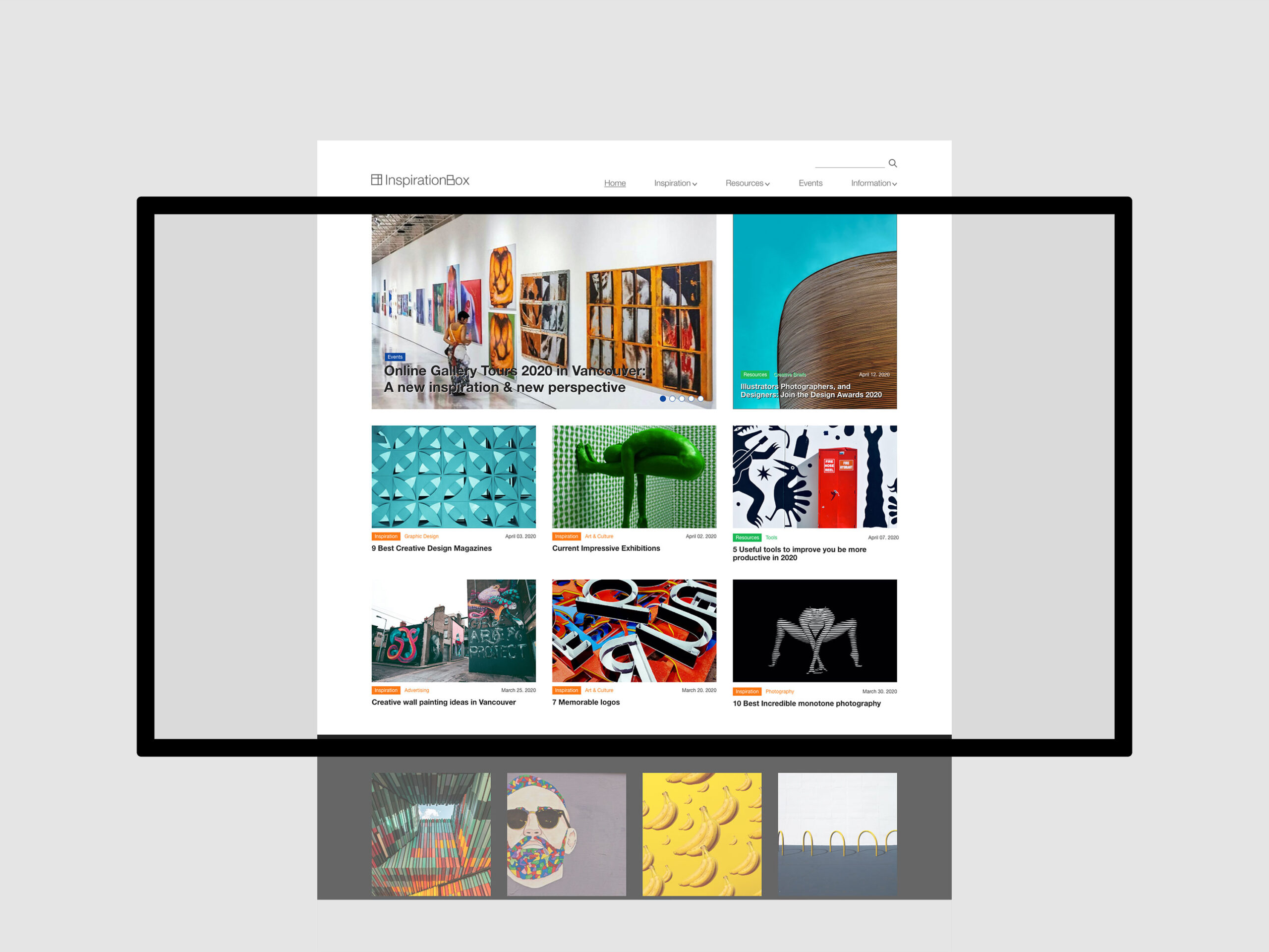
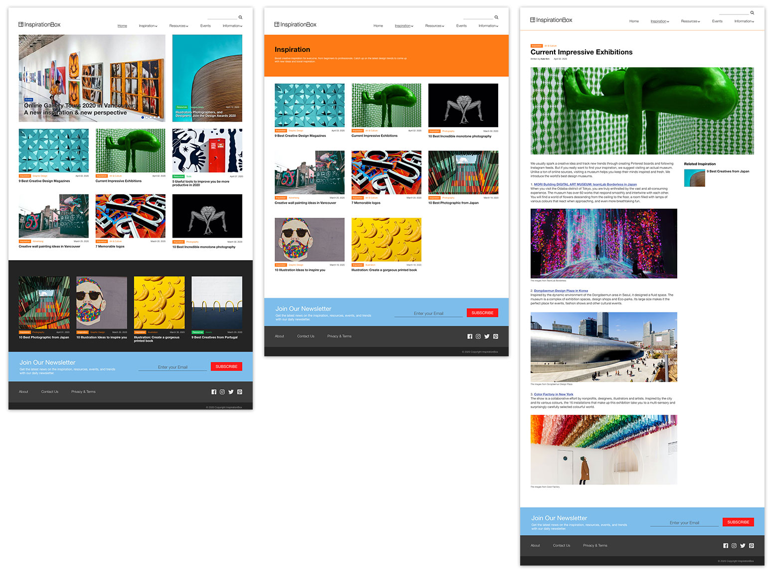
I created a mockup website for the development of Inspirationbox.ca. Inspirationbox.ca is a blog highlighting the best design, including advertising, Art & culture, illustration, graphics and photography.
UX / UI Design
Inspirationbox.ca

Information Gathering
This stage of discovery and investigation was about clearly defining and understanding the purpose of the website, the main goal I wanted to achieve, and the audience I wanted to attract to the website. The primary target audiences of this website are designers who are looking for ways to improve their skills and qualities. And secondary audiences are students who learn design and find current techniques, resources and events.
Planning
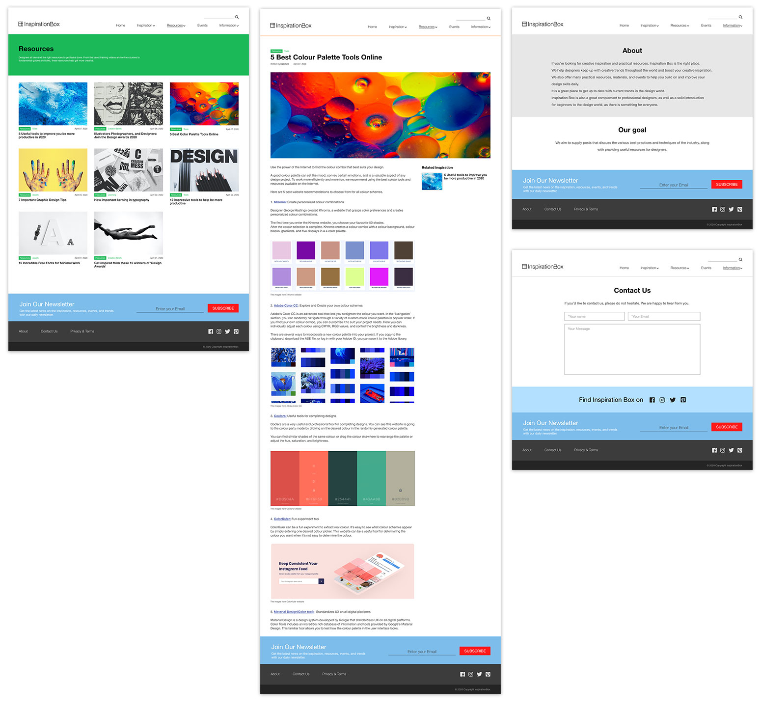
A site map was created based on the information collected in the previous step. The main page consisted of 5 pages: Home, Inspiration, Resources, Events, and Information.
Writing Content &
Meta Data
Content writing included writing headlines, a newsletter, and text for the website. The metadata included the web blog’s title, description, and keywords.
Meta Data
<head>
<title> Inspiration Box – Providing Creative inspiration and Practical Resources </title>
<meta name=”description” content=” We help designers keep up with creative trends throughout the world and boost creative inspiration. We also offer many practical resources and materials to help you build on and improve your design skills daily.”>
<meta name=”keywords” content=” Creative Inspiration, Design Resources, Design Events, Inspiration ideas, Design inspiration, Graphic design inspiration, Creative Trends, Latest design trends, Latest design events, Creative ideas, Design blog, The best graphic design blog, The best design resources, Advertising, Art & culture, illustration, graphic design, photographic “>
</head>
Design
The next step was the design of the website. At this stage, all visual content such as images and photographs were collected. The layouts included colours, logos, and images and provide a general understanding of this blog. The website’s colour is black and white, and the layout is organized using Grid to give it a clean and tidy feel. After designing the website, I designed an additional newsletter page.


